Translate

Showing posts with label color. Show all posts

Friday, March 22, 2013

The Hockey Applique Begins part 5

Well, I'm not sure if the thread work will be fun or not; it was really fun to design.  I think I may have created a monster with never ending applique and embroidery, in just about every color thread in the rainbow.  So where does one begin, when there are thousands of little pieces to be stitched?

Pick something easy to begin, it is important to get started. In the early stages of a project, sometimes the job appears to be overwhelming--like this one. After I have dealt with the initial hesitation, then I basically work from what appears to be on the bottom layer and work up to the top. This is because the ends of my starts and stops will be covered by another line of stitching on a segment that appears to be on top of it, and this secures any loose threads that need to be controlled. This bottom to top guideline, is the general rule, but of course I break it all the time! If I have blue thread in the machine, I'm not going to hop over and applique a red flower; I'm going to find something else blue to sew before I change my thread color again.
This is the back corner of the hockey bag. I've chosen to use a decorative stitch in variegated blue thread.

So I'm going to applique the hockey bag first with a beautiful blue variegated thread using some of the programmed stitches that my machine offers. The hockey bag is my starting point because it is underneath all the other objects in the picture.  I have chosen my favorite programmed stitch, and I use shiny thread with crisp tear-away stabilizer underneath. [This process will be covered in depth in my new booklet, Applique Ann's Way.]
Here is a sneak peek at the cover of my new booklet! Available in April.

Next I'll embroider the hockey sticks, covering them with thread.  This will be faster than appliqueing them and it will give them a wood grain look. Embroidery is done with a hoop, no stabilizer, and I move the hoop from side to side to completely cover the object. For detailed info see my book Coloring with Thread
A closeup of the embroidery with variegated beige thread, that gives a wood grain effect on the hockey stick.
 Now I realize the finely cut dandelions are curling up and starting to fray, so I'll embroider them next or they may just disappear. 
Dandelion detail in the lower left corner.  These too are embroidered.
So the applique and embroidery has just begun.  This is going to take me some time at the machine. Eventually this blog thread will be continued.  I have hours of decorative stitching ahead of me.

Ann Fahl

Saturday, December 22, 2012

Crisis in Orange

Here we are, Christmas is almost here. Everything should be red and green and sparkly.  So what's the problem?

You know I love the color orange.  It used to be my least loved color, but today it has become part of my repertoire. When I look back at my childhood, how could I have left that orange crayon in the box unused? Below, you will find an anatomically correct, Oreo, walking under some giant coneflowers on a warm background. Actually this was made of leftovers, but it is a really successful quilt.

Under the Giant Coneflowers, (c) quilt by Ann Fahl

Years back, before "Under" was created, the members of the quilt/art list helped me extend my selection of orange fabrics by sending me orange squares to create this colorful piece. I was hoping for 100 squares, but I actually received more than 300.  Wow, That's Orange is one of my top 10 favorite quilts in my career. There is more of the story on my website.
Wow that's Orange, (c) quilt by Ann Fahl

So what's the problem?  I'm wearing an orange top and jacket today; and I needed to wear my only pair of orange socks; my friend Sally gave them to me a few years ago. When I put them on, I realized there were holes in each heel, but I wore them anyhow! It's about time for these socks to go, sooooo sad, because I love them.  I guess I know what I'll put on my list for Santa!
Ann's favorite orange socks
 It is a sad day, but I will recover!

Merry Orange Holidays to everyone.
Ann Fahl

Friday, December 14, 2012

The Cat Hair Returns

Do you remember the first quilt show you ever attended? Or, the first show you ever entered?

My very first quilt was a blue sampler that I made for my mother. It was a large one, full sized and hand quilted. I entered it in the state historical society show, and won an honorable mention in 1979.  It was really exciting to get a ribbon on my first quilt.
Ann's very first quilt completed in 1978

At the time, I knew nothing about quilt shows, I'd never even been to one!  But the judge made a comment on the back of the ribbon that said, "Pet hair is distracting."

After that comment I thought to myself, "I guess I'll have to watch that when I enter another quilt in the show!" That was something I never even considered doing.

Eventually, when I had more of a studio to work in, there is a procedure that I follow. I always clean off my cutting table first, lay out the quilt, and go over it with a lint roller front and back.  This has always seemed to work.  I always mention that first judge's comments in all my lectures with good humor; in the hopes that it might convince others to check over a quilt carefully before going to a show, or be given as a gift.

Every time a quilt comes home after a show, I open up the box and admire it, and hang it up in my living room. Nine out of ten times my quilt will come back with little threads on it, that were probably from someone else's quilt!  How do I know that?  It's because the threads are always the wrong colors for the fabrics I used. Many times I wonder what famous persons' quilt they came from.  Had they touched?  Did they get to be friends?  Where do all these threads come from?  Do other people find them on their returned quilts too? This is truly one of life's mysteries.
Garden of the Sun God, (c) 2012 Ann Fahl

Late November, my beautiful Garden of the Sun God quilt came back from the IQA show in Houston. It looked beautiful when I opened it up. After finding the judges comment sheets, I sat down to look them over carefully.  (This can be either a very trying experience or a pleasant one.) Their comments were OK this time, but one of the judges took the time to write at the bottom, that I should use a lint brush to remove the pet hairs from the dark areas of my quilt!!! I had to laugh. Like other pet owners, I make an attempt to limit the cat hair in the house, but there is only so much I can do. I looked over the quilt, and I didn't see any Oreo hairs, but perhaps I have selective vision.
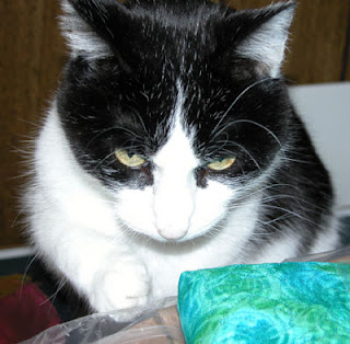
Here is Oreo helping to fold up a quilt.  Could this be the problem?

So I have come full circle in my quilting life.  The first quilt I ever entered in a show had cat hair on it; and the best one I've made to date--also had cat hair on it. And, probably the hundreds of quilts I have made in between also had cat hair on them. What can I say?  I do my best.

I hope this brought a smile to your day.
Ann Fahl

Friday, November 30, 2012

Quilting Fresh Salsa! part 1

Let the quilting begin.....................................................

Here is my sample flaming spiral.  I don't make pretty samples this is really how I work. Did you want glamour?
Let me tell you this quilt has been a challenge from beginning to end. Beginning in the center, I have planned on quilting a flaming spiral with red thread in the center.  Just to make sure, I practice on a sample first.

The actual flaming spiral in the center of the quilt. I like how the thread subtly blends with all the fabrics
The plan is to work from the center out.  I have taped my paper plan to my sewing table so I can refer to it as I move out to the next row.  This feels very much like following a cross stitch diagram or knitting pattern. So I continue to make small samples, change thread color where needed and keep moving outward.
Here is one of the first yellow arrow segments just outside of red center.
Quilting the yellow arrow segments began with a challenge. I wanted to try quilting it with the red thread, and after sewing one leaf, I realized the error of my plan.  The yellow variegated thread really worked the best.  Notice how it subtly emphasizes the leaves in the quilting pattern. I did the same thing in all four arrow segments.
Detail of dark variegated thread on the green triangles.
I worked around the next ring around the quilt, using yellow and red threads.  Then I got a chance to use the dark variegated thread on the green segment. I was very pleased with how it looked. It took quite some time to quilt my way out to the outer edges of the quilt.  I took my time, stopping for the day when I got tired.

I have found that when I quilt for extended periods of time I start to make mistakes and bad choices.  Since there is no deadline on this quilt, I can just take my time. This is a very relaxing way to quilt.

Along the way, I found that the darning foot was catching on the spots were all the seams come together. Since I have reached my limit of blog space, please see part 2.  Continue to scroll down.
Ann Fahl


Friday, November 23, 2012

Variegated Thread with Fresh Salsa?

My three choices for thread in the red areas of the quilt Fresh Salsa.

You may think that selecting thread for a quilting project is a small thing, but it's more important than you think.  It pays off when you make the right selection. So now I've got this top that is a cacophony of red, green and yellow, what thread should I choose?

One of my issues with sending your top out to someone else to quilt is that you usually get one color of thread for the quilting. This would make my quilts so boring! Mattress pads are quilted with white thread, how exciting is that? I choose to use multiple threads, usually depending on the color of the fabric where it will be used. No mattress pads for me.

Learn to machine quilt so you can finish your quilt in the manner you choose!  You can do it!

Auditioning the thread. This is shown using white paper just for illustration. It should actually be done on the fabric of your choice.
 Back to Choosing Thread:

  • Pull out all the colors you think might work.
  • Audition them by unreeling about 36 inches of thread and letting it puddle on the project.
  • Give each thread a rating:  yes, no, maybe.
  • Give a second look to the yes and maybe threads, I throw the ones I like best into a basket or bowl, so they are accessible when the quilting begins.
  • If unsure whether to use thread A or B, sew up a little sample of both; hold each sample up to the quilt top, and this should help you make your decision.
  • There is nothing worse than having to rip out lots of machine quilting, after you figure out, you should have used another thread! I have lots of personal experience in this area.
Solid color or Variegated? This is a personal question. Most of the time I prefer to use variegated threads when I quilt. It makes the stitching more exciting on solid color or mottled fabrics. But if you are using prints a solid color thread may be a better choice.  Audition both types of threads to see which you like best.

Contrasting or Matching thread?  Here are some tips I have learned over the years.
  • Matching thread will be less visible, and will hide irregularities in the quilting.
  • Contrasting thread will really accent the quilting, look great from a distance, but will show everything little booboo.
  • A slightly richer color will subtly enhance the quilting without being too distracting.
  • Lighter threads on deep fabric will usually look good.
  • Dark threads on light fabric are very challenging, all the mistakes will show.
  • The choices are up to you.
Rainbow variegated threads, # 851, 814, 844 from Superior Threads
I have chosen three threads to use on my quilt, most are subtle contrasts with the rich colors in the quilt top. The yellow will look great on the small yellow areas of the quilt, because it mixes several yellow tones there will be subtle contrasts and matching colors here. The red thread includes red, purple, and gold, this makes the red areas more exciting. The darker rainbow thread looks great on all dark fabrics and will make the green areas richer on this quilt top.

The quilting will begin next.

Ann Fahl

Friday, November 2, 2012

House Cleaning and Cat Hair

Most of you have heard about the book I published almost 2 years ago:  A Black and White Tale.  I am still proud of this book and all the effort it took to produce it. The book about Oreo has had a nice run, I find I only have a few cartons left in my closet.

The holidays will soon be upon us, so I have reduced the price from 17.95 to 14.95. Publication costs were higher than I had hoped so it has been priced higher than my $15 target.  Now that the quantities remaining are getting low, I'd like to clear out the closet and make room for new work.

This is a great book for anyone interested in my work. If you know someone that loves quilts or cats, this is a lovely gift for them.  Buy one for yourself. Order two, and I'll pay the postage.

My heart and soul went in to writing this book. Help me find good homes for the remaining copies!  You can read more on my website.

Saturday, October 27, 2012

Garden of the Sun God--The End

The last challenge is to find the right fabric for the binding. At first I thought perhaps it would work best to piece a variety of red fabrics together. But then I realized there was a lot of stuff going on in the border already, perhaps one or two fabrics cut on the bias would be a better solution.

It's wonderful when I go digging in my stash and can find a number of possible fabrics for the binding. I chose a red batik with lights, mediums and darks marbled through it.  Perfect. Always cut binding on the bias, the corners will turn flatter, and the long sides will lay flatter. For a thorough discussion on binding your quilt see my booklet on bias binding.


Announcing the completed quilt, Garden of the Sun God, by Ann Fahl, this quilt is now included in my Ancient Artisans gallery on my website.

The completed quilt, Garden of the Sun God, 52.5 x 63 by Ann Fahl © 2012
Ann

Friday, October 5, 2012

Garden of the Sun God -or- Harry leaves the paper

I have been arranging, moving, shifting pieces of the quilt, taking breaks, looking at the quilt again, and using binoculars backwards. Taking digital photos and carefully looking at the image on the little screen of your camera can also give you another view of the quilt.  I've moved Harry up, then down, over a little bit, and finally he is resting on two lily pads in the pond.


Harry finally gets pulled off of his paper foundation.
Almost all of the elements are in place.  Harry has been oh, so carefully removed from the baking parchment sheet and pinned in place.  Originally, I wanted him to rest on the big carp in the center, but I had chosen a light yellow/green/purple painted fabric and his feet disappeared due to lack of contrast.  So, I wound up cutting the fish in half, putting the fish halves on each end, and moving the lily pads to the center, so he could rest on them. Yes I could have fabricated a fish out of a different fabric, but I loved the first one I made, so this shift in plans made everything work!

Look at the papyrus on the left you will see a similarity in my arrangement  to one of my favorite quilts On the Nile. The "swooping" papyrus that crosses over the lower part of the sashing was inspired by a gold box that was included in the King Tut exhibit that traveled the world in the late 2000's.

There is still that empty red spot in the upper center of the quilt.  The symbol of the sun god will go there.  You can see my white paper pattern in the place where it is to rest.

Friday, September 14, 2012

Garden of the Sun God


It is time to introduce to you my latest quilt, completed this past spring.  You can visit it at Houston if you go to the big show in October.

At the time of its creation, my teaching schedule had slowed down considerably, so I had more relaxed embroidery and quilting time with this large quilt. It was a joy to make.  I did envision how this quilt to should go together, the background is 4 basic pieces, a little different from my usual style, but similar in feel to Egyptian Garden II.

The working title for this new quilt was Egyptian Water Garden III. The plan was to paint a large panel of fabric which would be divided into 3 thin strips for the background. I always cut the white base fabric a little larger than needed, to give myself some options in how to trim it up for the quilt. So I used about 1.5 yards of "prepared for dying" white cotton.  I poured and dribbled lots of sky blue stuff on the top and browns, greens and yellows for the lower edge.  I twist up the fabric into a long log so the Setacolor paints intermix in interesting patterns.

This is the hand painted panel, pressed, sliced into 3 sections, auditioning a sashing strip.
I envisioned a water garden, with papyrus, pink coneflowers, and a blue heron fishing in a lily pond. So above you see the very beginning! Remember, this will have an ancient Egyptian feel to it, but I created most of symbols to make it mine!

The sashing strips were cut from a rich hand dyed fabric by Dagmar Plenk of Milwaukee. It was a luscious fabric blending red, gold and rust dyes. It made me think of very hot desert when I saw it for the first time. Above the shorter center panel I will place the symbol of the Egyptian sun god.
The strips are pieced with the red sashing. The lower dark blue strip is being auditioned for the water.
The heron is supposed to be fishing in the pond, and I have decided that the special water fabric I have purchased is too heavy and dark.
Auditioning another lighter turquoise for the strip to become the pond.
This lighter fabric blends and subtly contrasts with the upper section, so I'm much happier with this selection.  Good thing I had it left over from my Orange Coneflower Quilt.

Auditioning red fabrics for outer border.
Now the inner section is complete. All the while I have been working on the background, I have been unsure about what to use for the outer border.  It must harmonize with the inside, yet be heavy enough to hold all the sections together. I'm not there yet.

More border auditions.
It seems that I'm getting closer to a border.  I like the fabric on the lower left that changes from bright red to dark red. This creates an interesting border with some movement; this works well with the water idea.

Tune in next time to view the exciting conclusion.......What will be chosen for the border!

Have a good weekend.

Ann Fahl


Tuesday, May 15, 2012

The Back Story of the Purple Iris Quilt and Pattern


Japanese vase made for export, early 1900's
 This quilt came to life during a teaching trip to Empty Spools Seminars at Asilomar two years ago.  I used a mixture of flower shapes so each bud and blossom was different.  There are tight buds, an unfurling flower, and 3 gorgeous flower heads, I love the way the flowers turned out. The shape of the flowers was inspired by an old Japanese vase.  I traced them off, enlarged them, and simplified some areas to make them easier to applique. I used all the rich royal purple fabrics I could find in my stash.  The good thing about the way I work is that I don't need large pieces of fabric for anything except the quilt back. To applique the long iris leaves I used a scalloped programed stitch on my machine that gave the edges a different look than anything I had ever done before.
Finished Purple Iris Quilt
During my workshop, I got all the flowers and leaves cut out and fused onto the background. It made such a beautiful picture that my students suggested that I made it into a pattern. After I finished the applique work, embroidery and quilting, I prepared the directions and pattern pieces. I created a terrific pattern cover and was so pleased with my work. 
The cover of Ann's new pattern
The stumbling block came when I realized the cost of having the pattern sheet printed, it was really expensive.  So I put everything away for awhile.  I pulled it out several times to proof read the direction booklet and check over the pattern pieces, but I didn't know what to do about the high cost of printing the 24 x 36 pattern sheet.  I had never used this large size of paper before. A second time I put it all away, trying to figure out a more economical way to print the large page.  Robbi Joy Eklow suggested I have it printed as a blueprint.  After I checked out several places, I had it printed.  I stuffed a dozen patterns in their ziplock bags and took them with me to Paducah and sold a few copies. 

Oreo demonstrating the proper cat etiquette for quilt sitting
Finally, it is ready for you to check it out, changing the colors will make this quilt your own.  How about red iris on a rich green background?  Or how about yellow flowers on a purple background?  Either of these would create a rich garden atmosphere. This is not a simple pattern, it is for someone with good machine quilting skills. The pattern envelopes are stuffed and ready to go to new homes!  You can check it out on my website.

Since I promised you, the back story, the photo above is showing the back side of the stabilizer and program stitches that I used to applique the long pointed leaves in place.  Isn't it lovely?

Have a wonderful spring.

Ann Fahl

Friday, May 11, 2012

Where is the Art? My Opinion...............

White Coneflowers, by Ann Fahl, my first "big" prize winner!
So I've been home from the big show in Paducah for awhile, and have been re-evaluating what I've seen and where my quilts should be displayed in the future.  As I walked through the show this time, instead of being overwhelmed by all the amazing work; I realized that my work no longer belonged there. Why? This is my same old song.  I am troubled by the lack of good design in so many quilts at so many shows. Oh yes, there were some wonderful pieces in the AQS show, but there were some that were not. AQS has been very supportive of me and my work, so I'd like to make it clear that this is about my opinion on what I see in all competitions, not just in Paducah.

What direction is the quilting world headed? I've been asking myself this for some time now, and my answer is: I don't understand where it's going and I don't want to follow along; I need to take my own path. It is  important that my quilts are uncluttered in design with strong visual impact.

A Brighter Day, by Ann Fahl, the most prize winning quilt I have ever made
I love thread work, of all kinds, but quilter's have gotten all tied up with doing too much thread work and heavy heavy machine quilting--to the extreme!  We have forgotten that the original design of the quilt is the most important element, the thread work in whatever form, just adds texture and surface interest.  As we have gone overboard on the heavy quilting, so have the quilt judges.  They are impressed by the quantity and quality of the thread work and they seem to have forgotten to consider the overall impact of the color and design of the quilt FIRST.

In my opinion, the overall design should be the first consideration when judging, then the workmanship should be considered next. In other words, only those quilts with good design should be selected from the category, then the workmanship should be evaluated to determine which ones are winners.  It appears to me that the quilting/thread work is evaluated first and wins the judges consideration so the design qualities are overlooked. This would account for so many quilts with poor design winning at shows. Yes the quilting is totally amazing on so many of the quilts today, but it isn't the only part of the art form. Great quilting cannot make a poorly designed and conceived quilt-- a good one!
George's Garden, by Ann Fahl

Whether one makes traditional quilts or original designs, quilting is a visual art form. We must step back from our work, and examine its visual impact.  Does it have a focal point? Does something draw the viewer in? Is there balance in the composition? Is there contrast between the colors and elements of the design?  Is there something that unifies the design (ties the quilt together,) such as repetition of shape or color?

Orange Coneflowers By Ann Fahl
What can you do to improve the visual impact of your work?  Take photos of your work in progress or look at the quilt with binoculars backwards. Always use a design wall to design and view the progress of your composition.  Read books on design or take a class. Look through books, magazines and websites and see what you like best, and what is most appealing to your eye. We need to take a step or two back from heavy quilting and spend more time on the initial design, this is what should "sell" your quilt to your viewer or a judge.

A prize winning or a successful quilt should have both a well designed top and great quilting!

Amen.

Ann Fahl

Thursday, March 29, 2012

The Show is Over

This happens every time at the conclusion of a show.  For months and sometimes years, I have prepared for an exhibit. The opening is a thrill, because the work is hanging on the walls and it looks so wonderful.  I can't believe that I have created all that stuff!

Then the end of the show arrives, everything comes off the walls of the gallery, and it gets packed up to go home. It's over.  Then this cloud seems to hover over your life.  It took so much preparation and it's over, another artist or group arrives to hang their show in your place.  So I'm feeling the downturn in my spirits.  Now when this happens, I'm not surprised and I understand what is going on.

This time, we are experiencing this wonderful very early warm spring in Wisconsin and I can go out and dig, rake and transplant! This is a sure thing, it makes me feel really good.
Hepatica, a wild flower that is filling a spot near an old stump on a hillside.
Little sprouts of May Apples are pushing through the leaves.
Here is a cluster of May Apples that are beginning to open.  Soon when will be like umbrellas that are knee high.
There are daffodils and narcissus everywhere. 

The King Alfred Daffodils bloom outside the windows of my studio.  On a warm day the fragrance is wonderful.

These white primroses have never bloomed for me.

These little primroses have never been so beautiful.  It must be the mild winter and early spring that has made them so large and colorful.
These purple ones are always the first to open up.  I usually find them in mid April when I push the leave aside and find them. 
All these flowers and brilliant colors have boosted my spirits, and when the weather is warm enough, I am in full gardening mode.  My quilting will have to wait!

Ann Fahl

Saturday, March 10, 2012

Quilts in Color, part 4

This blog features Barbara J. Schneider from Northern IL.

January 29-March 25, 2012
6501 Third Ave.
Kenosha, WI  53143
262-653-0481
hours 1-4:00 Tuesday through Sunday
All the artists have gotten a "fireplace" shot.  This one features 2 of Barbara Schneider's pieces from her "Reflections series.

Barbara J. Schneider  says  “I began quilting in 1996 and rediscovered the pleasure of working with cloth, paint, dye, and thread. My background is in visual design and I worked for many years as a designer in the publishing industry. I take lots of photos of found objects, nature, shadows and tactile details. These as well as my underlying interest in the Japanese concept of Wabi-Sabi have had a strong influence on the direction of my work.  I have an extensive background in surface design and teach as well as exhibit my work nationally and internationally. My artwork is in both private and public collections.”
 
Her Reflections series explores the concept of reflection and how to capture the essence of images that are not physically there, images made of light and movement, images that change. Her depiction of water is what draws me to her work.  She also uses other images, but in this exhibit she featured her water pieces. 
Quilt by Barbara J. Schneider,  from the Reflections Var. 1

Her work is an exploration and interpretation of natural images by enlarging and reshaping them. She collects leaves, pods, flowers, grasses and look closely at their structure and shape. In particular, Barbara likes to collect these natural objects at the end of summer when they have begun to wither and fragment. Looking at them closely and then enlarging them allows her to see them as sculptural objects. She captures the play of light upon surfaces, and shaping the pieces introduces a new element – light and shadow interacting with the undulating surfaces. 
A corner of Barbara J. Schneider's gallery, quilts from the Reflections series
Quilt by Barbara J. Schneider, Reflections Var 11
Even removing the color and designing in black and white her work is fascinating.  This quilt is very wide, but not tall, and completely filled a wall in her upstairs gallery with a Lake Michigan view. 

One other thing, Barbara included some of her 3 yard pieces, which she has printed and manipulated in many ways.  In the gift shop at the Anderson, there are several beautiful wall pieces for sale.

Barbara is from Northern Illinois. She teaches, lectures and exhibits her work extensively. http://www.barbaraschneider-artist.com

Come and visit the Anderson before this exhibit changes. 

My next artist featured will be someone without a web presence:  Rhonda Rodero.  Her work is wonderful.

Ann Fahl